Colors in UX Design: Selection and Interaction

Web designers and user interface (UI/UX) designers use colors in their work to draw attention to interface elements, increase brand recognition, and improve user perception. The choice of color palette can have a significant impact on the entire process, as different colors can evoke different emotions and moods in users.
Let’s look at some basics of color theory that will help you better understand how to choose colors for your projects.
I. Color Models
Color models are systems used to define color. They determine what colors can be created and how they can be displayed.
RGB
RGB (Red, Green, Blue) is an additive color model used for creating colors on a screen. It is one of the most common types of color model and is used for creating colors on screens, based on a combination of three primary colors: red, green, and blue. These colors are combined in varying proportions to create millions of color combinations. RGB is widely used in visual digital design.
CMYK
CMYK (Cyan, Magenta, Yellow, Key) is a subtractive color model used for printing. It is based on a combination of colored inks: cyan, magenta, yellow, and black. CMYK is typically used for printing brochures, business cards, magazines, and other printed materials.
HSL
There is also HSL (Hue, Saturation, Lightness), a color model based on three primary color properties: hue, saturation, and lightness. It is used for selecting a color palette for web design and user interface design. HSL allows for more precise and flexible color selection and modification.

II. Color Properties
Understanding color properties can help designers choose the right color palette for websites and mobile applications. Here are some examples of colors and their associations in the business domain:
- Blue is associated with stability, trust, and professionalism. It is often used in financial and banking services, such as in the mobile app Revolut, where it enhances the impression of reliability and security.
- Yellow can be used to draw attention to promotional offers and encourage user action. For example, in the mobile app AliExpress, yellow is used to indicate discounts and promotions.
- Green is associated with health, ecology, and growth. It can be used in web design to demonstrate a brand’s environmental consciousness. For example, in the mobile app ECO Planet, green is used to showcase natural elements and eco-friendly products.
- Red can evoke an emotional connection with the audience and create an impression of urgency and importance. For example, in the mobile app Uber, red is used for the “Order” button and enhances the impression of speed and reliability.
III. Color combinations
Color combinations can impact the effectiveness of UX in web interfaces. For example, using conflicting colors can lead to user misinterpretation of information.
Analogous harmony
This is a combination of colors that are next to each other on the color wheel.
Blue, purple, and pink in the Instagram app are used in analogous harmony to create a soft and calming impression.
Complementary harmony
This is a combination of opposite colors on the color wheel.
Blue and orange in the Spotify mobile app are used to grab the user’s attention and provide a sense of liveliness and energy.
Triadic harmony
This is a combination of three colors that are equally spaced apart on the color wheel.
Yellow, blue, and red on the Adobe website are used in triadic harmony to emphasize the brand’s power and stability.
Monochromatic harmony
This is a combination of colors that differ only in saturation and brightness.
Various shades of blue in the Twitter mobile app are used in monochromatic harmony to emphasize simplicity and conciseness in design.
Split complementary harmony
This is a combination of colors that are on opposite sides of the color wheel from one another.
Blue and orange on the Firefox website are used in split complementary harmony, creating an impression of interaction and harmony.
Tetradic harmony
This is a combination of colors that are spaced 60 degrees apart on the color wheel.
Blue, green, and red on the Fitbit mobile app are used in tetradic harmony to emphasize the brand’s dynamism and energy.
Watercolor harmony
This is a combination of colors that are next to each other but have different levels of saturation.
Various shades of blue and green on the Apple website are used in watercolor harmony to emphasize the brand’s purity and freshness.
Calm harmony
This is a combination of colors that have similar levels of saturation and brightness.
Blue and gray on the Slack website are used in calm harmony to emphasize the brand’s simplicity and depth.
IV. Tools and Factors
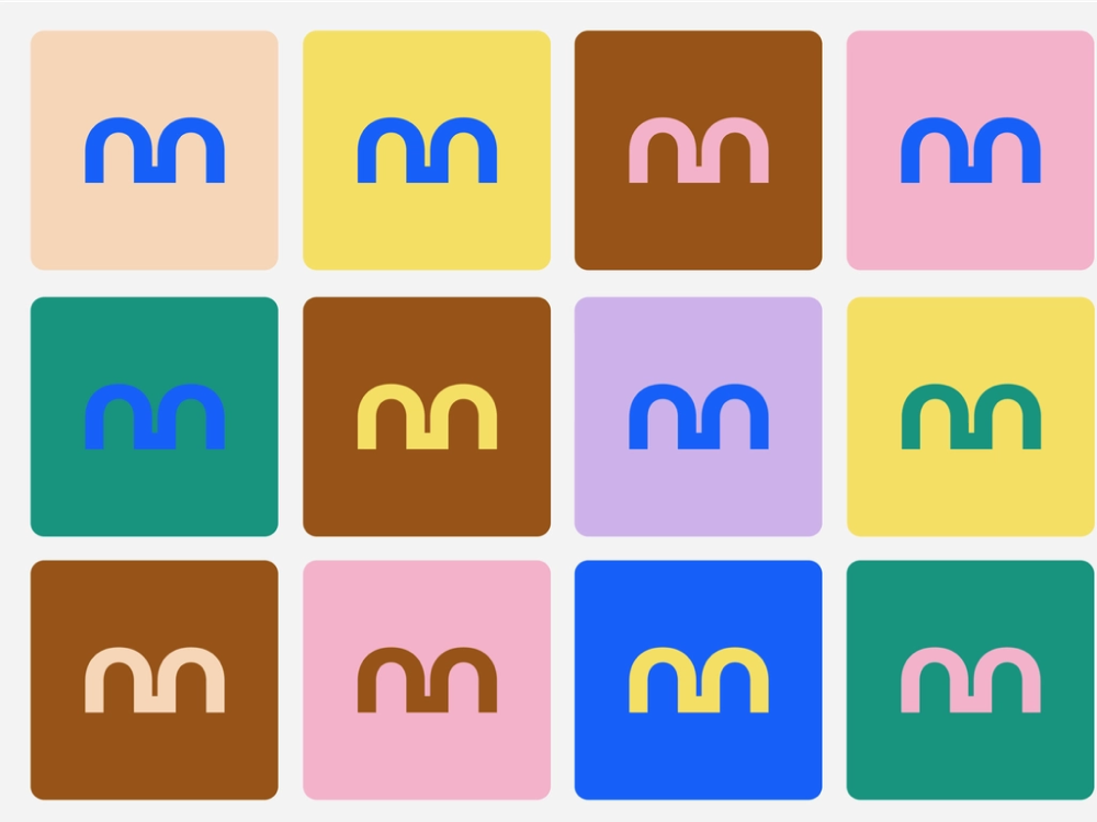
When selecting color combinations, designers can use different tools to assist in the process.
- Color Hunt offers free color palettes that can be used in UX design.
- Paletton allows you to choose a color scheme that takes into account the brand of the company and its target audience.
- Coolors allow you to quickly and easily select a color palette for your project, as well as establish rules for their interaction.
In addition, various design tools such as Adobe Photoshop, Sketch, and Figma have built-in color selection features that allow you to quickly choose a color palette for your project.
The designer should consider the brand of the company and its target audience so that the color palette corresponds to the brand colors and is perceived by users as information about the company. It is also necessary to consider the functionality of colors.
The main principle of color selection is to make them work together to create an aesthetic and effective provocation of expected impressions. The ideal color combination attracts users and increases the effectiveness of UX design.
- For example, the Amazon website uses a light background color palette, which provides simplicity and ease of perception for users. Amazon’s color scheme is based on a white background with an accent on orange, which is preserved in the company’s logo and complemented by different shades of gray.
- Another example is the Airbnb mobile app, which uses yellow and blue color palettes. The yellow color is used to call action (for example, “Book”) and the blue color is used for messaging and navigation. The Airbnb color combination creates an impression of brightness and optimism, which positively influences users.
V. Using the Environment
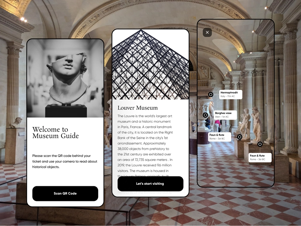
Color can be used not only within design but in combination with the surrounding environment to enhance the user experience.
When a user views a website or mobile application from their smartphone at night, a white background can be very harsh against the darkness. To reduce discomfort for the user’s eyes, the designer can use a dark background or softened colors to create a more comfortable atmosphere.
It is also important to consider the framing effect when using colors in design. This effect means that the color scheme and composition of the design affect the perception of individual elements. Colors can highlight specific elements and indicate their importance or connection to other elements. Using contrasting colors around the “Buy” button can make it more noticeable and attract the user’s attention.
Overall, the designer should not neglect the analysis of color in future projects. In fact, we can create an emotional component using colors alone. It is even better when color serves as a mediator of emotions and decision-making.
When designing a mobile application for a sports club, the designer can use vibrant, saturated colors to create an energetic and motivating atmosphere that attracts new users.
It is also important to use color combinations that are suitable for a specific business. For example, if creating a website for a hospital, the designer can use blue, which is perceived as cool and calming, to emphasize professionalism and trust.
VI. Accessibility
To ensure the accessibility of using colors in interface design, I recommend paying attention to the following:
- Use sufficient contrast between colors.
This allows people with different types of color perception to easily distinguish interface elements. As a rule, it is recommended to use a contrast between text and background of at least 4.5:1. - Avoid using color as the sole way of conveying information.
For example, if you need to mark required fields on a form, it is better to use additional signs or text rather than just coloring the field. - Consider the possibility that some people may not distinguish certain colors.
For example, people with color blindness may not distinguish between red and green colors, so these colors should not be used as designations for operations that require special attention. - Use different ways of marking data depending on their importance.
For example, if you need to mark which elements are required to fill in, use more saturated colors or bold font. - Test the color accessibility of your interface with different tools.
This will allow you to check how well colors are distinguished in your design.
To conduct certain tests, I can recommend several tools. For example, the Color Contrast Checker allows you to check the contrast of colors, which should comply with WCAG 2+ (Web Content Accessibility Guidelines) to ensure the accessibility of websites. Another tool is the Accessibility Scanner, which helps detect accessibility issues on mobile devices.
In addition, when creating interface design, it is worth considering the technical limitations of some devices and programs. For example, some screens have a limited number of colors or may not support certain color effects. Therefore, it is necessary to test the design on different devices to make sure that it is accessible to a wide audience.

VII. Tips and Testing
One of the most effective ways to test how color combinations work is to test them on different devices and in different lighting conditions. This helps to see how users can perceive content in various situations.
A lifehack for testing colors is to use the “invert colors” feature on devices to see how colors look in negative form. This can help identify issues with text readability and other design flaws.
It’s also important to use color contrast checking tools that can help determine whether a color combination meets accessibility standards. Such tools can be found on the internet or in smartphone apps.
A/B testing can also be used to test colors, which helps compare the effectiveness of different color combinations on real users. This can help determine which colors work best for your project.
Overall, color testing is an important step in the UX design process. Using different testing techniques and tools can help evaluate the effectiveness of color combinations.
VIII. Conclusion
In conclusion, colors play an important role in how users perceive information and interact with interfaces in UX design. The selection of colors should take into account the psychological aspects of color theory, accessibility and environmental factors, as well as be tested on different devices and with varying contrast. There are many tools and life hacks available to help designers choose the optimal color combination for their project.
This article was particularly challenging for me… Thank you for your patience and support, see you next week!
As always, I would appreciate any constructive criticism :)