How to: User-centered design — a brief guide
Disclaimer: The information in this article is quite subjective, and the narration is presented with a simplified explanation and an attempt to demonstrate the basics.
- What is UCD?
- The client side — three pillars or the peculiarities of choice
- Fundamentals of methodology
- Conclusion: how and why
What is UCD?
User Centered Design — a methodology or approach that systematically identifies user needs and transforms them into a product. The main value is the focus on what the user is accustomed to, what is “simple” for them, and what meets their basic needs.
The main difference is in the habits and atmosphere in which the user is accustomed to “brewing”; we do not try to restrict the user to achieve goals. Goals are achieved naturally, often not allowing for qualitative identification of opportunities and direct needs.
If we visualize the UCD process, we would get circular waves:
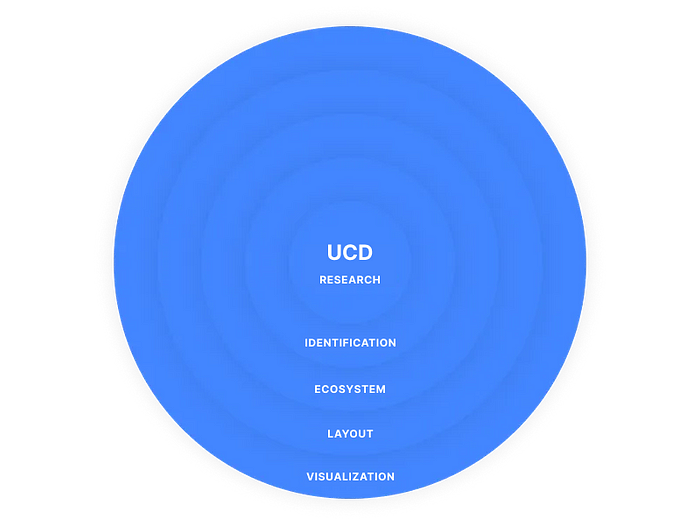
When we talk about circular waves in UCD, we should remember that each wave is not a separate entity. I’d rather say it is a part of the whole that we identify for the sake of convenience and a systematic approach.
The client side — three pillars or the peculiarities of choice
Of course, in choosing a methodology, the designer has the main “vote” for or against it, but let’s consider what is important for the client themselves and what aspects we should pay attention to first.
Financial benefit
Is not a secret that this is one of the main arguments that clients pay attention to.
The main myth regarding this point is “UCD helps to save money.” Actually, it doesn’t. UCD helps to achieve the set goals and structure the information and users’ views on the product.
The approach is not a panacea that saves millions. The approach is a set of opportunities, and savings and other things depend solely on the quality of the product itself, in the global plan. Otherwise, there would be no difference between companies that invest tons of money in design, marketing, etc., and companies that simply use UCD as a dogma.
User Loyalty
This point can be related to anything — it depends on the point of view, but now, we are talking about the ecosystem.
Bright examples can be any time-killers in the form of social networks and similar services. Here, it is important to be able to “respond” to the user’s “desires,” but within the framework of a specific product.
The more options you provide to the user, the more difficult it will be for them to understand and use the product. It is important to remember the primary needs of the users, as it is through them that they pay attention to the product and take the first steps in using it.
Interaction results
It’s simple: if you don’t focus on user needs, someone else will.
An example of focusing on users in User-Centered Design can be conducting user testing, where a designer puts users first and investigates their behavior and feedback during interaction with the product. This allows obtaining important feedback and determining how to improve the user experience of the product. Thus, the designer can adapt the product to the needs of users, which ensures its more successful implementation in the market.
Methodology Basics
A little earlier, I mentioned the levels (see the image above), and now we will take a closer look and try to explain why they are needed. First of all, dividing something complex into smaller parts is simply convenient. In fact, you can identify and name all the pieces differently, it mostly depends on the designers themselves, and how they prefer to divide the process into levels, stages, etc.
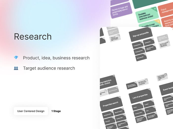
Research
- Product, idea, business research
Here we start with understanding the business itself: we study goals, competitors, and requirements. We try to delve into and possibly even predict what awaits us within a specific product. We gather a “knowledge base” about what we will be working with. - Target audience research
Already at this stage, we divide users into groups and highlight the main factors of behavior and interaction. These are the first steps of study that will help us gather Personas and “humanize” our audience.
The “Research” stage differs in that we try to immerse ourselves in the product itself: we try to study it, see what it represents, and create “key points” for ourselves in the future.
The main difference is conciseness. It turns out something like a plan with subheadings; a skeleton that will allow, with the help of further stages, to create nerves, muscles etc.
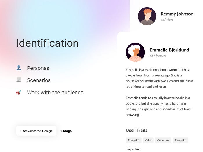
Identification
- Personas
These are collective images based on common factors such as habits, areas of interest, age, geodata, and more. When creating personas, we essentially divide our users into groups, which we call “Personas”. The main goal of this image is to classify our users so that we can understand what is more typical of them and what we need to work with. - Scenarios
Here, as before, I don’t want to complicate things, so I recommend perceiving scenarios in their classic form, where we build a certain path of user interactions, predicting actions, etc., but here we also pay attention to small actions.
Example: The user landed on the homepage → clicked on the “Login” button → The login form opened → and so on.
There are more “advanced” scenarios that describe use cases, mood, etc., but often low-level scenarios are enough to understand what to expect from users in general.
- Work with the audience
After we have identified our users, we can work with them: ask questions, conduct mini-tests, etc. Essentially, this is a stage of interactions where we take our users and torture them until we get answers to all our questions. :)
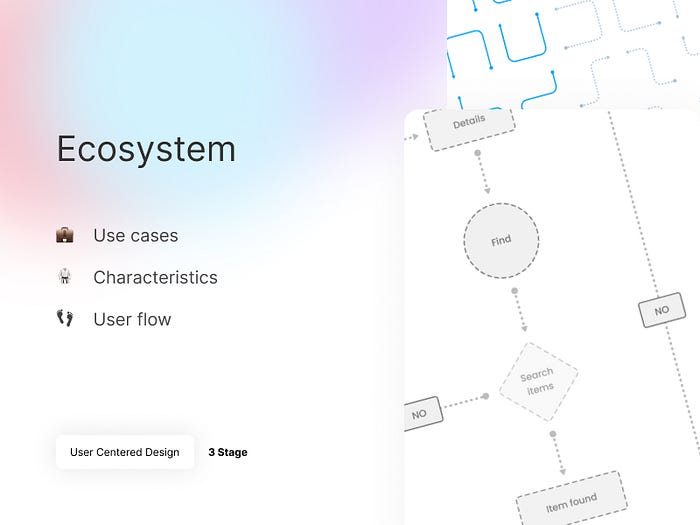
Ecosystem
- Use cases
A certain “grain” — the minimum unit of interaction. On the other hand, this is a technical description of the interaction with a function. I recommend starting by considering use cases as any simple interaction between the user and the product. - Characteristics
After going through the entire path described above, we can already formulate some requirements. Yes, maybe we already have some of these requirements, but every designer is a little paranoid and still prefers to verify most of the requirements and hypotheses. At the same time, we can consider “characteristics” as a residual description, as description, and work with “blind spots” that we still have. - User flow
Here everything is quite simple: user flow is the path of the user and how he goes through the product.
Yes, in some places this concept intersects with scenarios (especially in this article), but these are completely different things.
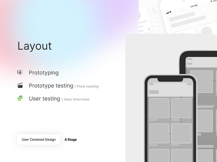
Layout
- Prototyping
At this stage, we already have all the necessary information to create wireframes, prototypes, and so on. Essentially, we can already imagine a schematic (possibly even conceptual) vision of the product and start testing our hypotheses. - Prototype testing (in particular — Flow testing)
One of the simplest types of testing. We identify the main user path, set a goal, and ask users to reach that goal. We track how they achieved it and adjust the path to simplify the interaction. - User testing (in particular — User interview)
How do you find out what users think? The simplest way is to ask them a question. There is no “panacea” and no instant universal solution here, as everything depends on what you want to learn from users. Also, the questions are formed depending on the goals and possibilities of conducting the interview itself. In general, interviews are divided into two types: open (the user is free to write a “novel” as an answer) and closed (the user chooses between the suggested answer options), which can be conducted both online and offline.
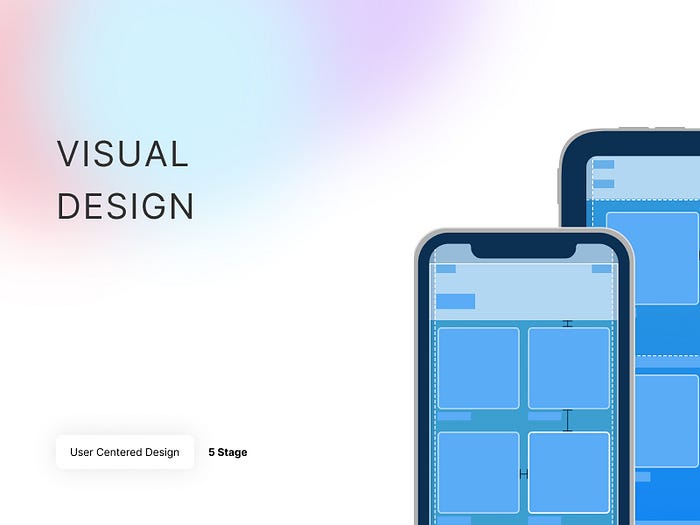
Visualization
- Visual design
At this stage, we understand that most of the paths have been traveled, most of the schemes have been tested, and we can already start working on the final result of our UI journey.
In fact, it’s not that simple. Visualization implies working out what has been described above in a more visually understandable way. Here we simply understand that we have enough information to create a “full-fledged” interface. Then, most of the stages may be repeated, but already on an (almost) ready-made layout.
Final thoughts — how and why
This methodology helps, jokingly speaking, not to lose the “path of truth” during the design development. However, it should be noted that methodologies are only intended to help, not to become dogma. When we follow the UCD process, it is easier for us to understand what comes after what, how to work, and what to pay attention to. It is also worth remembering that many items are optional, and in your case, they may not be applicable for various reasons.
Thank you for your attention!
This is a translation and adaptation of one of my first articles. I would appreciate constructive criticism, and please remember that everything described in the article is my subjective opinion.