Typography in UI/UX: Key Aspects and Practical Tips

Hello everyone! In this article, we will consider how to choose the appropriate fonts for website and interface design, paying attention to typography and reading patterns. We will learn about examples of fonts and font pairs, as well as receive practical advice on selecting and using fonts.
The main task of this article is to tell about the available options and what to pay attention to. All of this is in simple terms, so please consider this material as a kind of quick tips, suitable for beginners and so on.
The Importance of Typography in Design
Typography plays a key role in creating the visual perception of website and interface design. Studies in this field have revealed how certain typographic elements affect users and their perception of information.
In fact, in the world of interface design (and not only), some well-known companies have conducted interesting research that should be considered when choosing and using fonts. Here are a few examples of research and their results:
- IBM and the study on readability
IBM set out to determine the optimal font parameters to improve readability. Their research showed that fonts with a high letter width/height ratio and optimal letter spacing provide better text perception. - Google Fonts and the study on the impact of fonts on load speed
Google Fonts, a large font resource, conducted research on the effect of font choice on webpage loading time. They found out that the use of lightweight fonts and optimized caching can improve loading speed and webpage performance, affecting overall website optimization. This point can have a significant impact, for example, on "Google Page Speed Insights" indicators. - Adobe and the study on the emotional impact of fonts
Adobe is studying the impact of different fonts on users' emotions and moods. They conducted a study showing that fonts with rounded shapes can create an impression of gentleness and friendliness, while fonts with elongated shapes can convey an impression of severity and professionalism.
In my opinion, these studies help to better understand the properties of fonts and their impact. They provide valuable findings and recommendations that can be used when choosing and using fonts in design (UI/UX) - so I recommend paying attention to them ;)
Font Selection - Tips
Selecting the appropriate fonts and creating harmonious font pairs is an important step in the process of designing websites and interfaces. Let's look at the steps that will help you carry out this process and ensure a pleasant user experience.
- Understanding Goals and Audience: Before choosing fonts, it is important to understand the purpose of your project and the needs of your target audience. What impression do you want to create? What mood should the font convey?
- Contrast and Harmony: Using fonts with similar or contrasting characteristics can create an interesting visual effect. Try combining fonts with different weights, serif and sans serif fonts, different styles. It is worth noting that accessibility should be kept in mind.
- Compatibility and Proportions: Fonts should complement each other and create a comfortable hierarchy. Consider letter proportions, spacing between characters, and the overall style of the fonts.
- Testing and Adaptation: It is important to check how the chosen fonts look on different devices and screen resolutions. Make sure the text remains readable and comfortable for users. I want to say that this point is becoming less relevant nowadays, but I added it more due to heritage: if you want to maintain the style of a certain platform - try to use "native" fonts or those similar to them.
- Popular Font Pairs: It's often worthwhile to use well-known and successfully combined font pairs, such as "Roboto" with "Merriweather" or "Montserrat" with "Lora". These pairs have already shown their effectiveness and stable connection in design.
Remind yourself that font selection is a creative process that requires time and experimentation. Don't be afraid to try different combinations and adjust the font pair for your specific project. Always test and adapt your choice - font selection should not be a limitation of the process, it's a supplement.

Popular Types of Fonts
I've noticed that generic names are used more and more often, so let me explain the terms "serif" and "sans-serif" font and other types of fonts in simple language:
- Serif font: Serifs are additional decorative elements in the form of small "tails" or "lines" that extend from the ends of letters. For example, Times New Roman is an example of a serif font. It is used more frequently in printed materials, such as books and newspapers, as serifs help improve the readability of long texts.
- Sans-serif font: Sans-serif fonts, unlike serif ones, do not have additional decorative elements at the ends of letters. They have a simpler and more modern look. For example, Arial is a popular sans-serif font. They are used more frequently in digital media and on websites, as their simplicity promotes readability on screens of different sizes.
- Monospaced fonts: Monospaced fonts, like the Courier font, have equal line thicknesses, without bends or curves. They are often used to create an impression of mechanical or technical aesthetics. These fonts are popular in programming and code editors.
- Handwriting fonts: Handwriting fonts resemble hand-writing. They have irregular letter shapes and appear more personal and creative. For example, Brush Script is an example of a handwriting font. These fonts are used to create invitations, logos, or illustrations where individuality and uniqueness need to be emphasized.
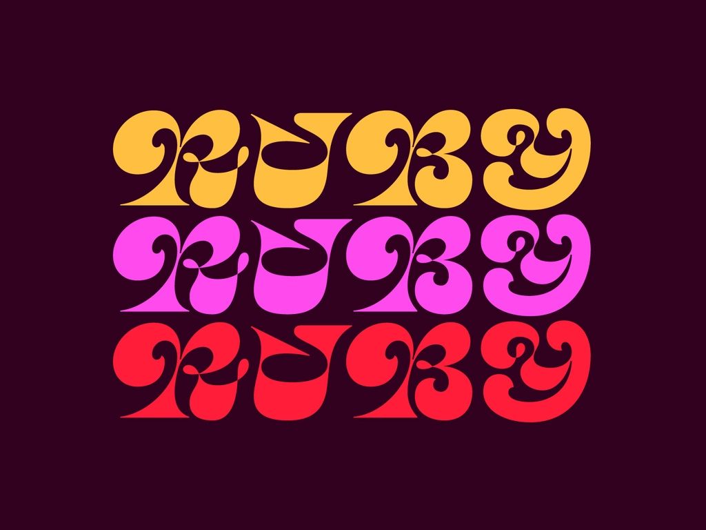
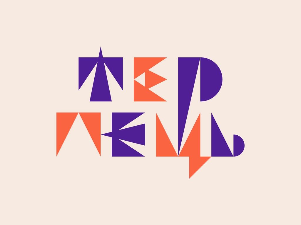
- Decorative fonts: Decorative fonts are fonts with non-standard shapes and elements that give them a unique style. They are used for expressive and creative design. For example, the Lobster font is a decorative font that is often used in logos and accent design elements.
These are just a few examples of types of fonts, but I'm sure that now navigating this vast quantity will be a bit simpler.
Font Pair Selection and Examples
When choosing font pairs, it's important to pay attention to several key aspects. Here's what to consider:
Contrast and Harmony
Strive for some contrast between the fonts in a pair, so they look visually appealing and create 'interesting' combinations. Avoid pairing fonts that are too similar in style or size as this can lead to a loss of expressiveness and hierarchy.
Example: The 'Roboto' and 'Merriweather' pair is a good example of contrast.
'Roboto' is a modern sans-serif font, while 'Merriweather' is a classic serif font. This combination creates excellent contrast and adds 'interest' to the design.
Interaction of Styles
When choosing font pairs, pay attention to how font styles interact with each other. They should be compatible and blend harmoniously, creating a unified aesthetic. Avoid font pairings that clash too much in character and mood.
Example: The 'Montserrat' and 'Lora' pair demonstrates good style interaction.
'Montserrat' is a modern sans-serif font with geometric forms, while 'Lora' is a classic serif font with beautiful serifs. Both fonts have a similar mood, allowing them to coexist harmoniously in the design.
Readability
One of the main criteria when choosing fonts is their readability. Consider how easily the font is read at different sizes and in the context of your design. Avoid fonts with too narrow proportions or unusual shapes that could make reading text difficult.
Example: The 'Open Sans' font is often used in a pair with 'Source Serif Pro'. Both fonts are highly readable even at small sizes, making them effective for use in text content.
Usage Context
Consider the context in which you plan to use the font pair. For example, more conservative and serious fonts might be chosen for a business website, whereas a creative project can experiment with more unconventional and expressive fonts.
Example: For a youth brand store website, a sans-serif font pair could be used with expressive headings and a light font for the main text, adding modernity and energy to the design."

Using the right fonts can significantly improve the perception and interaction with your apps and websites.
Remember, font selection should take into account readability, aesthetics, and the context of your project. Experiment with different types of fonts and their combinations, but don't forget about the basic principles of design, such as simplicity, consistency, brand alignment, and so forth.
Enjoy the creative process, including font selection, and experiment with different options to create a unique and attractive design. Remember, fonts play a crucial role in creating impressions and communicating, so invest your creative energy into each choice ;)
I wish you success in your creativity, and may your fonts help create magic and unforgettable experiences for each user!
As always, I would appreciate constructive criticism, and don’t forget about my Twitter and Medium :)